- All
- Leisure
- Housing
- Offices
- Retail
- Showrooms
- Stands
- Others
- catalogs and others
- Books, catalogs and others
- Digital publications
- Articles
Corporate interior design and office solutions manual
Banco Madrid
Corporate interior design and office solutions manual
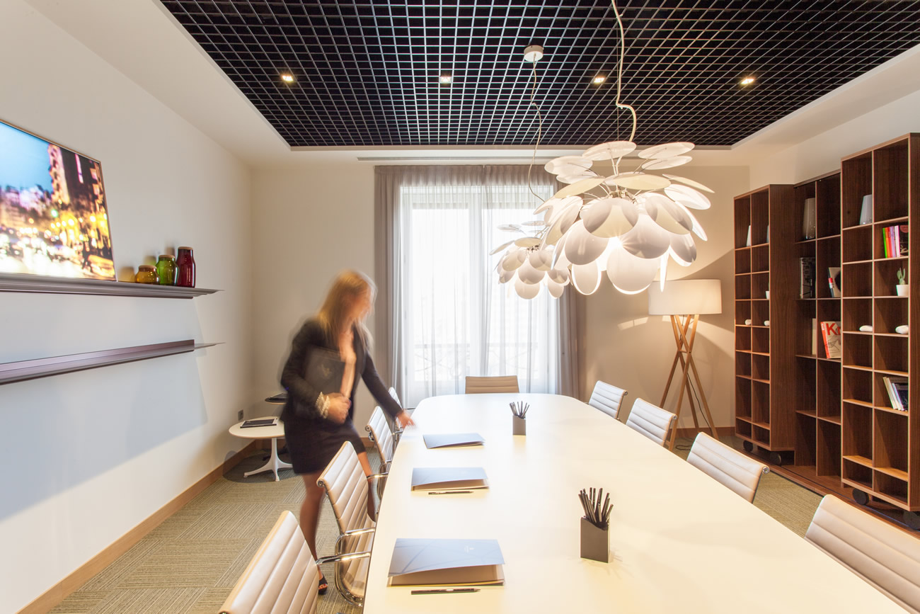
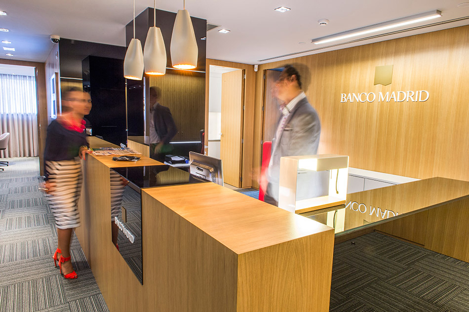
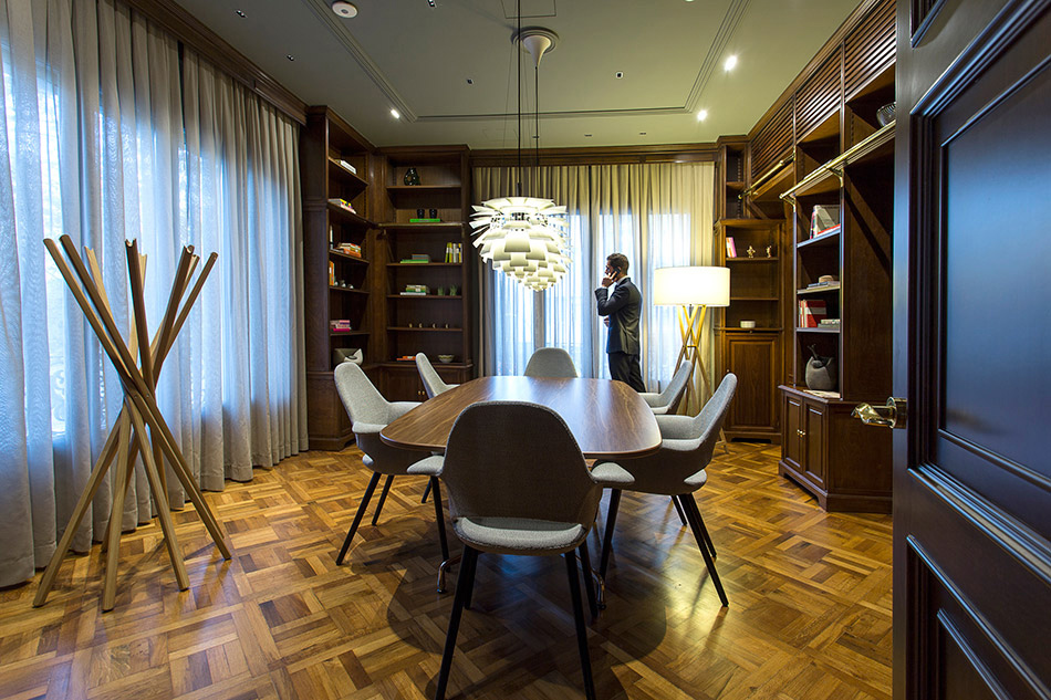
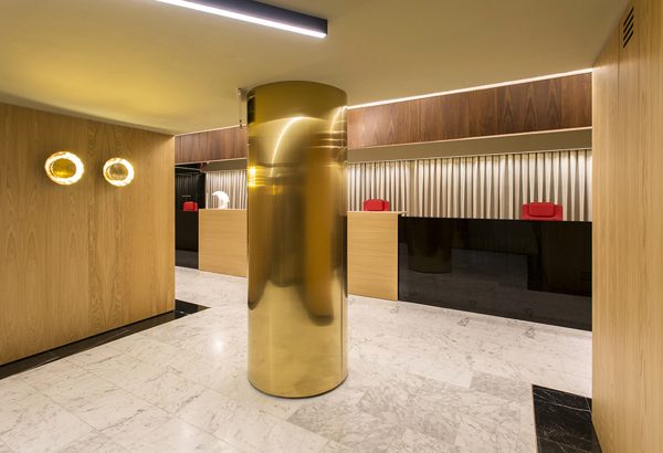
With the strategic goal of redefining their brand and identity, Banco Madrid set us the task of designing their corporate interior design manual. As our basis, we consider architecture and interior design to be tools to help communicate and reinforce a brand’s values. This allowed us to design a manual that could be used as an instrument to bring each of the entity’s different spaces into line, defining a set of parameters and common guidelines in order to build unique and recognisable places. These spaces must be able to transmit the entity’s values to customers and employees alike, thus helping to reinforce and define the brand. In this way we turn architecture, interior and design into integral parts of the corporate communication system. To organise the key concepts that define the brand strategy of this private banking entity, we drew up a concept map, giving structure to a series of values in a coordinated network based around four main concepts: rigour, tradition, exclusivity and innovation. The manual was built as an open and flexible tool that can cover the design of any of the entity’s offices. The colours are divided into four chromatic ranges, which in turn match the brand’s graphic identity. Next, we worked out a carefully considered selection of materials, listed according to their type: wood, glass, metal, stones, paints, textiles and ceramics. After that, we put together a catalogue of elements to meet a variety of needs, such as furniture, lighting, ceiling and floor coverings, accessories and complements. In this section, there was also a space for some elements that, although they may not strictly form part of an interior design project, help to strengthen a clear and coherent corporate message, for example a proposal for an alternative to the classic employee uniforms, musical ambience, distinctive aromas or plants and flowers.
The manual also suggests using art to demonstrate commitment to culture through the medium of signature photography. In each office, a young photographer will be hired to produce their personal interpretation of their city, paying tribute to the place itself. Lastly, we applied all the aspects and elements included in the manual, and designed the functional and operational areas for a hypothetical commission of corporate headquarters and offices. These areas are divided into two categories: private banking for customers, and workspaces for employees. Between 2012 and 2015, this manual has been applied in the complete reform of the Barcelona headquarters, and in the branches in Valencia, Murcia, Alicante, Bilbao, San Sebastián, Madrid, Marbella, Málaga, Vitoria and Vigo.
Project: Stefano Colli
Photography: Xavi Torrent, Mikel Alonso, Sergio Murria, Gustavo Sanabria, José Yo Sigo, Miquel Pereira, Kalo Vicent


